
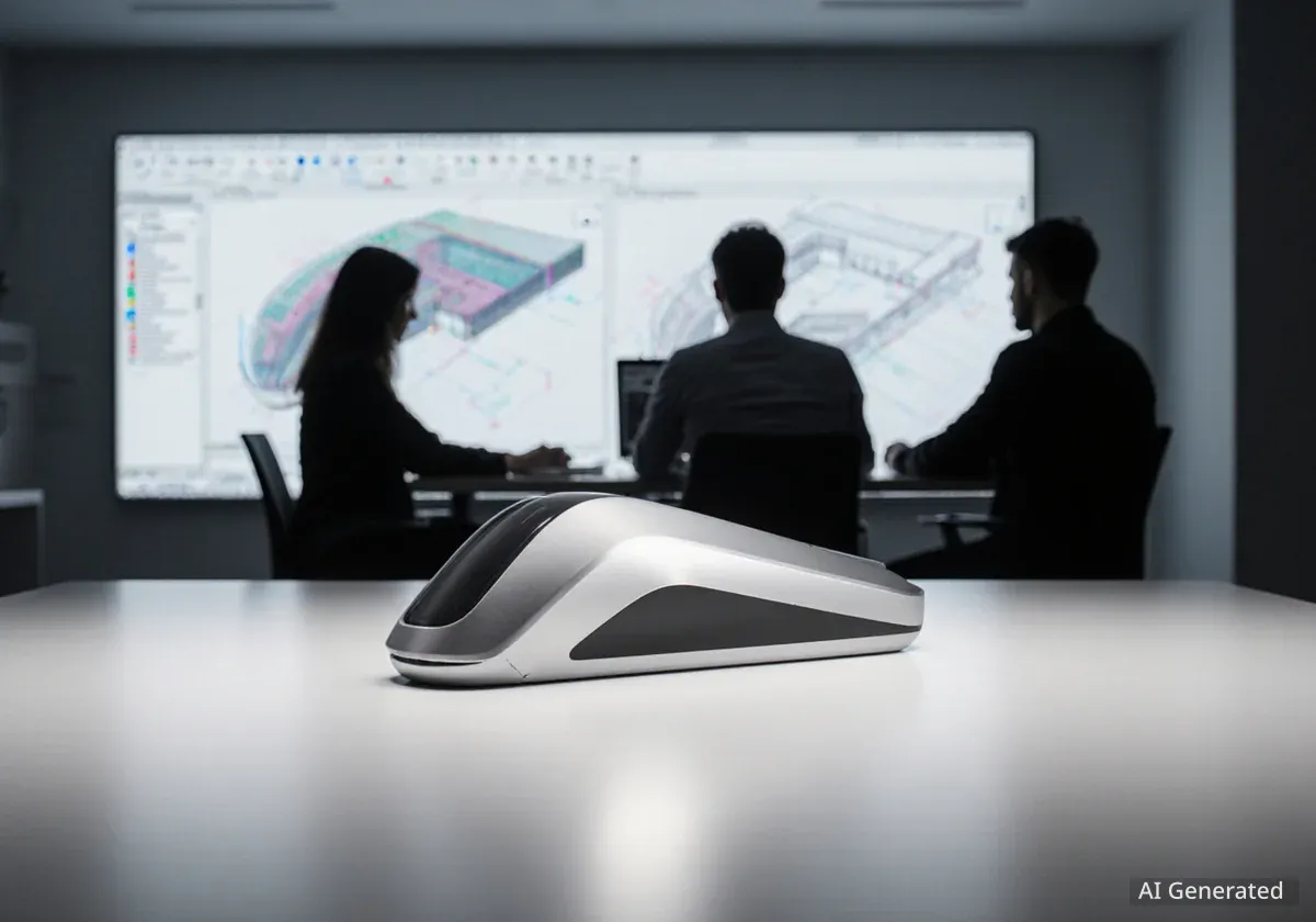
Ruslan Abasov, a typeface designer based in Lausanne, Switzerland, approaches his craft with a unique blend of geometric forms, photography, and design theory. He views designing typefaces as an expressive act, comparing it to "dancing" with his arm. Abasov's work often involves unconventional methods, including drawing letterforms with a 1990s-era computer mouse.
Key Takeaways
- Ruslan Abasov sees typeface design as a form of storytelling.
- He uses experimental tools, like a vintage computer mouse, to create unique letterforms.
- His typefaces are often inspired by visual arts and design concepts.
- Abasov believes type design shares parallels with filmmaking in its creative process.
Early Influences and Design Philosophy
Abasov's journey into typeface design began during his studies in Istanbul. There, he discovered a deep connection between typefaces and his existing interests. These included geometric shapes, the art of photography, and various design theories. A pivotal moment was attending an IsType conference, which motivated him to pursue formal type design education at ECAL.
Now residing in Lausanne, Ruslan develops typefaces that are both playful and deeply rooted in his interest in design education. He perceives letters not just as symbols, but as textural shapes. This perspective comes from his background in working with multiple scripts, specifically Cyrillic and Latin. He treats each alphabet as if it tells a story, much like a narrative.
Background on ECAL
ECAL, or the École cantonale d'art de Lausanne, is a renowned art and design university in Switzerland. It is known for its innovative approach to design education and its focus on experimental and contemporary practices. Many influential designers and artists have studied there.
Innovative Approaches to Letterform Creation
One notable example of Abasov's experimental design is his typeface, Mouris Display. The name "Mouris" comes from the French word for mouse. For this project, Abasov faced a specific challenge: to develop a unique tool that would create a distinct writing style.
Instead of traditional calligraphy tools, a collaborator suggested using a 1990s-style computer mouse. This type of mouse features a silicon ball on its underside. Abasov decided to soak this trackball in fast-drying ink. He then used it to freely draw letter shapes, exploring its fluid and bouncy movements. He describes this process as a form of "dancing" with his arm.
"Throughout the entire design process I was contemplating the universe of the typeface – by which I mean its music, its feeling, its color code, and photographic sensibility. Thankfully, all of this was already there at the highest level," Ruslan Abasov stated.
Daido Display: A Photographic Inspiration
Another of Abasov's significant typefaces is Daido Display. This design is an expressive and poetic tribute to the Japanese photographer Daido Moriyama. Abasov was particularly captivated by Moriyama's mastery of light and shadow, and he focused on capturing the essence of Moriyama's visual language in his typographic work.
Did You Know?
Daido Moriyama is a famous Japanese photographer known for his black-and-white street photography. His work often features grainy, high-contrast images that capture the gritty reality of urban life.
The creation of Daido Display involved a deep immersion in the photographer's world. Abasov considered the typeface's overall atmosphere, including its implied "music," emotional quality, color palette, and photographic sensitivity. He aimed to reflect these elements directly within the letterforms.
Exploring Machine-Driven Design with Escargot Display
In Escargot Display, Abasov continued to explore the possibilities of machine-dictated Bezier drawing. This project centered on developing an alphabet through a collaborative process. The focus was on the intricate relationship between positive forms and negative counter-forms within letters.
Given the keywords "condensed" and "slow," Abasov incorporated elements reminiscent of Art Nouveau. He created dreamlike forms that dance around the uppercase letters. This design choice served to emphasize a sense of slowness, even within the strict limits of a condensed sans-serif typeface.
- Mouris Display: Created with a 90s computer mouse, exploring free, bouncy movements.
- Daido Display: Reflects the photographic style of Daido Moriyama, focusing on light and shadow.
- Escargot Display: Combines machine drawing with Art Nouveau elements to convey slowness.
Type Design as Filmmaking
Abasov frequently draws parallels between his type design process and the film industry. He sees many shared aspects between the two creative fields. In filmmaking, a production company provides a brief or script, often based on market needs, and a "cast" is assembled.
He notes a key difference, however. In type design, there is often not the same large-scale collaborative system seen in film. Instead, the final typeface often becomes the intellectual property of a single designer. Sometimes, it is the work of a small group within a foundry, which is a company that designs and sells typefaces.
This comparison highlights Abasov's view of typefaces as complete works, each with its own character, mood, and narrative. His approach shows a commitment to pushing the boundaries of traditional type design through artistic exploration and innovative techniques. His work continues to influence contemporary typography by blending historical influences with modern, experimental methods.