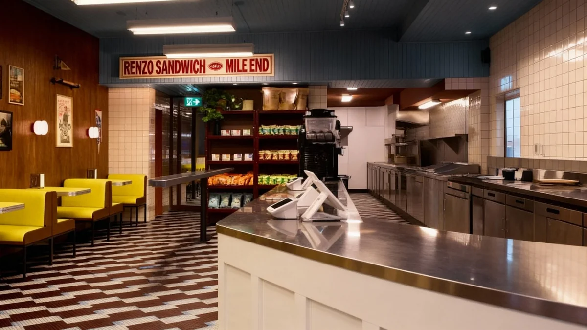

Renzo Sandwich, a new eatery in Montreal's Mile End neighborhood, features a distinctive 1970s retro design. Local architecture and design firm MRDK, also known as Ménard Dworkind, created the interior with bright yellow upholstery, formica elements, and a nostalgic color palette. The 1,275-square-foot space aims to evoke the feel of classic mid-century diners.
Key Takeaways
- Renzo Sandwich in Montreal features a 1970s retro interior.
- MRDK designed the space with bright yellow and warm materials.
- The shop emphasizes functionality, warmth, and understated nostalgia.
- An open kitchen highlights craft and transparency in sandwich preparation.
- Custom elements include fridges, display cases, and mosaic tile floors.
Design Concept and Atmosphere
The design for Renzo Sandwich focuses on creating an immersive experience. MRDK stated that the interior is more than just a backdrop; it is an integral part of the overall visit. The firm aimed to strike a balance between warmth, functionality, and a subtle sense of nostalgia from the moment guests enter.
The space measures 1,275 square feet, or 118 square meters. It incorporates warm materials and stainless steel details. These elements are a direct nod to classic mid-century American diners. The goal was to make the space feel as if it has always been part of the neighborhood.
Design Fact
The total area of Renzo Sandwich is 1,275 square feet (118 square meters), a compact space designed for maximum visual impact and efficiency.
Key Interior Features
Upon entering, visitors immediately notice the bright yellow two-seater booths. These booths run back-to-back along the left-hand wall. The yellow upholstery matches the formica tabletops. These tabletops extend from wood-paneled walls located between the booths.
Pale orange covers the seats of retro-style stools. These stools are positioned along a counter in front of the street-facing window. This color scheme, combining bright yellow and pale orange with wood tones, strongly references the 1970s aesthetic.
"The interior of Renzo was imagined as more than just a backdrop, it's an integral part of the experience," said MRDK. "From the moment you step inside, the space strikes a balance between warmth, functionality, and understated nostalgia."
Lighting and Flooring Details
Circular sconces by In Common With are installed above each table. Linear overhead lights are centered over a thin rail. This rail defines the queue area. It can also serve as a casual dining spot for customers. These lighting fixtures complement the retro theme.
The floor features mosaic tiles in burgundy, beige, and pale blue shades. These tiles are laid in offset rows. This pattern and color combination further reinforces the 1970s design influence. The flooring choice adds another layer of period authenticity to the shop.
Background on MRDK
MRDK, also known as Ménard Dworkind, is a Montreal-based architecture and design firm. They are known for creating unique commercial and residential spaces. Their previous projects include the Vietnamese restaurant Le Red Tiger, also in Montreal, which used a similar bold yellow and chocolate brown palette.
Functional and Transparent Kitchen
A light blue shade is applied to tongue and groove boards. These boards span the ceiling and wrap over a change in height towards the back of the shop. This dropped ceiling area marks the location of the public bathrooms and the kitchen area.
The kitchen is situated behind a stainless steel-topped service counter. It is an open kitchen concept. This design allows guests to observe the preparation of their sandwiches. According to MRDK, this transparency is a core part of Renzo's ethos.
"At the heart of the room, the open kitchen allows guests to witness the choreography behind every order: sandwiches assembled with speed, care, and precision," MRDK explained. "It's a subtle reminder that craft and transparency are part of the ethos here."
Merchandise and Branding Integration
Chilled products are available in "grab and go" fridges. Bold red lettering on lightboxes above these fridges describes their contents. These units are integrated into a larger, dark wood display case. This custom-made case also presents dried goods and Renzo merchandise, such as branded items.
The same hand-painted branding used on the fridges appears on menus and interior wall signage. This consistent branding extends to the shop's exterior. The design aims for a cohesive and welcoming identity, suggesting a timeless presence in the community.
- Seating: Bright yellow two-seater booths, pale orange retro stools.
- Materials: Formica tabletops, wood-paneled walls, stainless steel details.
- Lighting: Circular sconces by In Common With, linear overhead lights.
- Flooring: Mosaic tiles in burgundy, beige, and pale blue.
- Ceiling: Light blue tongue and groove boards.
A Sense of Permanence
MRDK emphasized that Renzo Sandwich does not aim to be flashy. Instead, the design seeks to create a feeling of permanence. The intention is for the shop to feel as if it has always been there, a familiar and welcoming place for repeat visits with friends.
The studio's work on Renzo Sandwich aligns with their other projects that incorporate distinctive color palettes and design elements. For example, their design for Le Red Tiger restaurant also featured bold yellow and chocolate brown tones. This consistency showcases MRDK's signature approach to commercial interior design.
Other recent projects by MRDK include an upgrade of a Calgary airport lounge and a cedar-wrapped residence in a Quebec forest. The photography for Renzo Sandwich was done by Mathieu Lévesque, with the project team including Guillaume Ménard and Fabrice Doutriaux. Construction was handled by Construction Mévia.