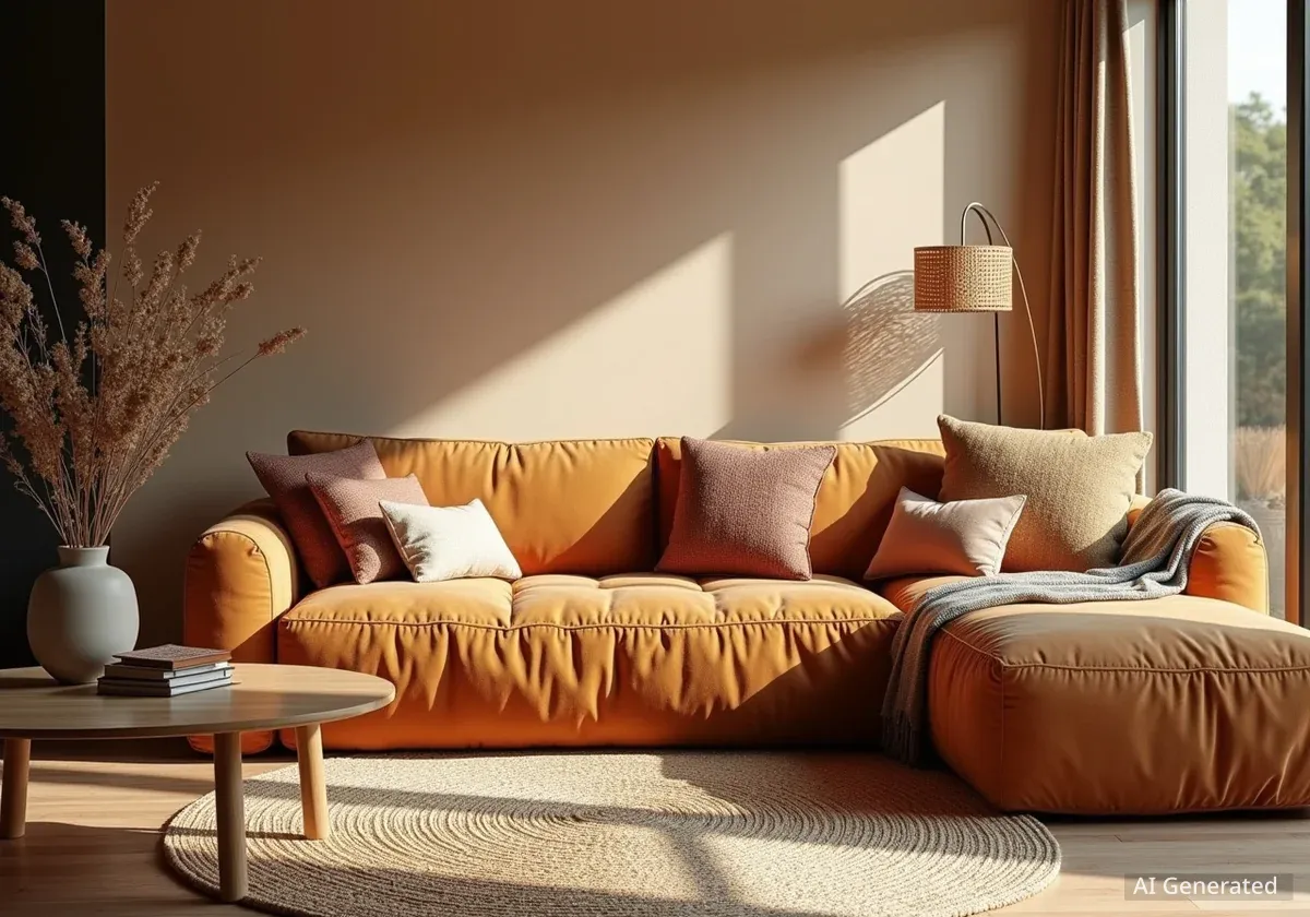
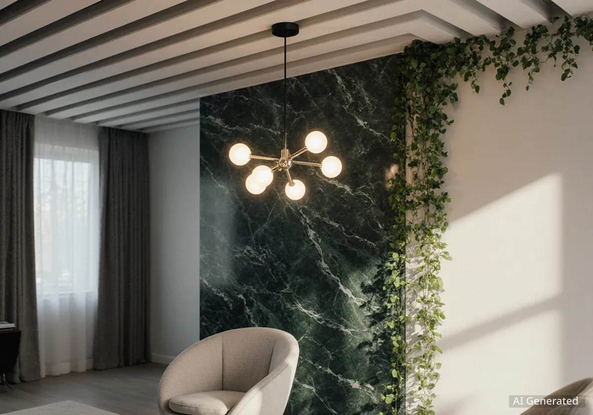

Interior design experts are signaling a significant shift in home aesthetics for 2026, moving away from previously popular all-white, all-gray, and overall neutral palettes. This change reflects a growing desire among homeowners for spaces that offer more warmth, depth, and personal character. Designers now prioritize rich colors, varied textures, and natural materials to create inviting and unique environments.
Key Takeaways
- All-white kitchens are losing favor due to their sterile appearance.
- Widespread all-neutral palettes are seen as flat and lacking focal points.
- Gray as a dominant color is considered cold and dated.
- Designers prefer natural woods, textured stones, and warm color schemes.
- The focus is shifting towards personalized, cozy, and restorative home interiors.
All-White Kitchens Fade from Popularity
For many years, the all-white kitchen represented a classic and safe design choice. However, this trend is now seeing a decline in preference among professional interior designers. According to Lexie Saine, founder of Lexie Saine Design, all-white kitchens often appear sterile and lack personality, especially in homes with unique architectural features.
Saine notes that a monochromatic white scheme can feel one-dimensional and does not always age well. This design choice, once considered timeless, is now perceived as less appealing. Designers are seeking alternatives that offer more visual interest and warmth in culinary spaces.
"For years it's been considered a safe, classic choice, but in reality, it often falls flat, especially in homes with real character or architectural history," Lexie Saine states. "An all-white palette can end up feeling sterile and one-note, and it doesn't always age gracefully."
Instead of uniform white, Saine advocates for kitchens that incorporate diverse materials and colors. This includes natural wood tones, stone with distinct patterns, and a variety of hues that introduce warmth and depth. Such combinations are believed to create a more personal and engaging atmosphere.
Designers' Preference Shift
- Natural Wood Tones: Valued for warmth and texture.
- Stone with Movement: Adds character and visual interest.
- Warm Colors: Creates inviting and personal spaces.
The Decline of All-Neutral Palettes
The broader trend of using all-neutral palettes throughout a home is also losing its appeal. Hannah Griffiths, founder of Studio Palindrome, observes that while individual neutral colors like white, beige, or taupe can be timeless, their widespread application across an entire living space often results in a bland or commercial feel. This approach, intended to create a spa-like tranquility, frequently misses the mark.
Griffiths explains that human eyes naturally seek a focal point within a room. When a space is entirely neutral, it lacks the contrast, pattern, and visual texture needed to make it vibrant and truly timeless. The absence of these elements can make a room feel uninspired and uninviting.
Many homeowners are now considering adding more color to their interiors. This shift encourages individuals to move beyond the fear of introducing bolder hues and embrace a more dynamic aesthetic. The goal is to transform calm-but-bland spaces into lively and engaging environments.
Understanding Visual Contrast
Visual contrast is essential in interior design because it helps define elements and guide the eye. Without it, a room can appear monotonous. Incorporating different shades, textures, and patterns creates visual interest and prevents a space from feeling flat.
Gray's Fall from Grace
Among neutral palettes, gray, once a dominant and seemingly safe choice, is now seen as particularly dated. Pantea Bionki, founder of Bionki Interiors, shares the view that gray, despite being marketed as a timeless neutral, often makes spaces feel flat, cold, and uninviting. This perception has changed significantly, especially in the years following the global pandemic.
Bionki highlights a shift in homeowner preferences. After experiencing prolonged periods at home, people began to desire spaces that felt restorative, cozy, and welcoming. Gray, she argues, does not provide this emotional comfort. Its cool undertones can contribute to a sense of detachment rather than warmth.
This does not mean homeowners must embrace extremely bold colors. Instead, warm neutrals and earth tones offer excellent alternatives. These palettes align with the current desire for homes that nurture both mental and physical well-being. They provide a sense of calm and connection to nature, making living spaces feel more grounded and comfortable.
"Homeowners began craving spaces that feel restorative, cozy, and welcoming, and gray doesn't deliver that emotional comfort," Pantea Bionki explains. "These palettes provide a sense of calm and connection, aligning with the shift toward homes that nurture both body and mind."
The movement away from all-gray interiors reflects a broader cultural shift towards more personalized and emotionally resonant living environments. Designers are increasingly focusing on creating spaces that tell a story and reflect the individual tastes and needs of their occupants, rather than adhering to universal, minimalist trends.
Embracing Warmth and Personality
- Warm Neutrals: Offer a softer, more inviting alternative to cool grays.
- Earth Tones: Connect interiors with nature, promoting a sense of calm.
- Personalized Touches: Incorporating unique items and meaningful colors makes a home feel more authentic.
The consensus among leading designers is clear: the era of stark, minimalist neutrals is drawing to a close. As 2026 approaches, the focus is firmly on creating homes that are rich in color, texture, and personal meaning, fostering environments that are both beautiful and deeply comforting. This evolution in design prioritizes lived experience over stark aesthetics, inviting a more vibrant and individual approach to home decor.