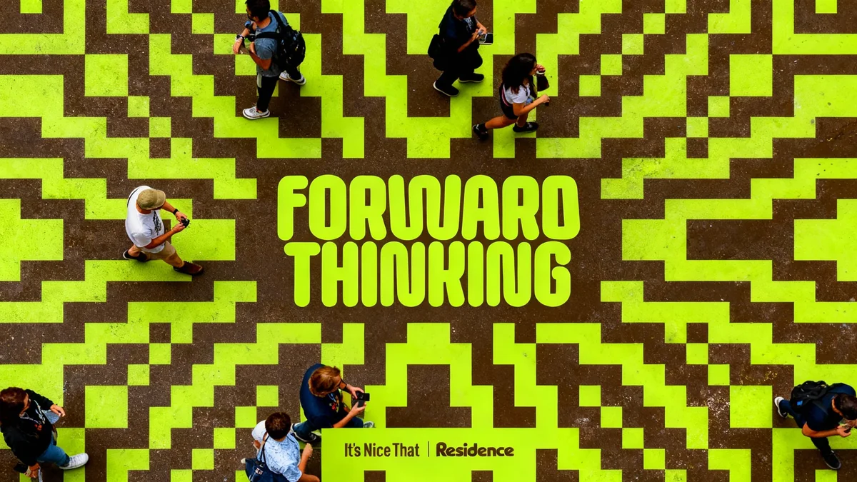
As the digital world becomes increasingly polished and automated, a distinct counter-movement is emerging in graphic design. Creatives are pushing back against pixel-perfect aesthetics, instead embracing tangible, imperfect, and human-centric styles. This shift signals a growing desire for authenticity in a landscape often dominated by artificial intelligence and flawless digital rendering.
Looking ahead to 2026, several key trends reflect this move toward the raw and the real. From the gritty texture of a low-ink photocopier to the chaotic charm of mismatched typography, the visual language of the near future is shaping up to be intentionally flawed, deeply personal, and refreshingly analogue.
Key Takeaways
- The Photocopier Aesthetic: Designers are reviving the lo-fi look of office printers, embracing grain, smudges, and low-ink effects as a stylistic choice.
- The Collector's Index: Visuals are being organized into neat inventories, resembling scientific collections or sticker sheets, celebrating the act of curating objects.
- Micrographic Details: Tiny, technical information typically found on packaging or blueprints is being elevated to a primary design element, suggesting expertise and depth.
- Fluid and Blotchy Logos: Brand marks are becoming less rigid, adopting organic, melting, and variable forms that are ideal for digital motion.
- 'Pick and Mix' Typography: The rules of consistent letterforms are being broken in favor of eclectic, collaged type that prioritizes expression over perfect legibility.
1. The Return of the Office Photocopier
In an era of high-resolution digital imagery, the humble office printer is making an unexpected comeback as a key stylistic tool. Designers are deliberately using the unpolished qualities of scanners and Xerox machines to create a raw, gritty look that feels grounded and authentic.
This trend, which could be called the "warning low ink" aesthetic, uses imperfections as features. Grainy textures, the faint shadow of debris on the scanner glass, and uneven ink coverage are no longer errors to be fixed but unique embellishments. This approach has deep roots in punk and grunge zine culture, offering a direct response to the often sterile perfection of modern digital tools.
A Pushback Against AI
This movement is seen by many as a reaction to the rise of AI image generators, which still struggle to replicate the nuanced, layered feel of mixed-media and analogue processes. By leaning into techniques that are difficult to automate, designers are re-emphasizing the human hand in their work.
We are seeing this style appear in various projects. The launch campaign for the typeface Oficía Mono by designer Charlotte Rohde prominently featured the photocopier look. Similarly, Louis Garella’s logo for the electronic music duo Sonata Electronica uses fading ink to create a sense of movement and dissolution, as if the image is dancing on the page.
The technique extends beyond typography. Photographers are scanning their prints to achieve a nostalgic, 1980s magazine feel, while artists like Alice Isaac build dense, dynamic collages that begin with physical cut-outs and scans. This embrace of the imperfect, tangible process is expected to grow significantly in 2026.
2. The Visual Index: A Passion for Collecting
The act of collecting and organizing objects is transforming into a distinct visual format. Designers are arranging assets into neat, grid-like inventories, creating visual catalogues that feel both scientific and sentimental.
These compositions lay out items like specimens in an entomology display case or trinkets in a wall-mounted curio cabinet. Objects are often presented as flattened cut-outs, isolated from their original context and arranged without a consistent sense of scale. This creates a fascinating visual language that is part archive, part artwork.
Nostalgia Drives the Trend
This impulse to catalogue may be linked to a broader cultural revival of collecting, reminiscent of childhood sticker books or trading cards. The trend taps into the simple joy of ownership and curation, making it highly relatable.
Examples of this "visual index" are widespread. The design studio Sunroom has used the technique in its snail mail projects, while artist Miguel Vides has incorporated it into his posters. This approach can be playful and nostalgic, as seen in Wonderhood's identity for Parish Primary School, or it can be more utilitarian, like the instructional layouts in Hyejin Song’s book of sushi utensils.
By presenting everything at once, these designs can be highly functional for instructions or simply celebrate the joy of a curated collection. This framing device for our visual hoarding is poised to become even more prevalent as designers find new ways to organize and display information.
3. Micrographics Take Center Stage
The tiny, functional markings we often ignore—the microscopic text on food packaging, the symbols on electronic components, the diagrams on labels—are being brought into the spotlight. This trend, known as micrographics, elevates the aesthetic of technical information from a background detail to a central design element.
These miniature layouts, packed with symbols, grids, and tight typography, evoke a sense of precision, expertise, and complexity. They borrow from the visual language of industrial blueprints, data readouts, and chemistry diagrams to imply a deeper layer of specialized knowledge within a project.
"Designers are adopting these tight typographic overlays, grids and timestamps as visual devices that imply technical depth and a more specialised knowledge in projects."
This style is particularly prominent in the sports world, where technical performance is key. Astrae Studio has used micrographic elements extensively in campaigns for major brands like Nike and in the identity for its own sportswear line. Art director Zak Jensen focuses on magnifying these hidden details, turning something as mundane as the type on a bread-bag clip into the main event.
While these elements can add visual balance to a layout, their primary function is to build a sense of authority and intricacy. In 2026, we can expect to see more brands using this hidden language of hyper-functionality to communicate expertise and add layers of discovery to their visual systems.
4. The 'Blotch': Logos Become Fluid
Logos are shedding their rigid, permanent forms and embracing a more variable and fluid identity. A noticeable trend is the rise of "blotchy" wordmarks that look as if they are melting, leaking, or drawn with a bleeding marker pen. This move away from sharp, clean lines introduces a sense of organic movement and adaptability.
This aesthetic is not about being messy, but about creating a dynamic, living brand mark. These forms are perfectly suited for an age where motion design is integral to a brand's expression. They look like they are already on the move, whether bubbling up like liquid or gently stretching into new shapes.
- Angelina Pischikova and Karina Zhukovskaya's identity for the dog-wash brand Mud embraced a messy, blotchy look.
- Cash and Carry's animated wordmark for the wine brand Other created a logo fluid enough to be poured.
- Clemens Piontek and Clio Hadjigeorgiou's identity for the Swiss Art Awards turned blotches of type into abstract forms.
The utility of these forms is clear. Monotype's "shape-shifter" logotype for the lingerie brand Chantelle Pulp features letterforms that delicately stretch to "celebrate all shapes and sizes." As the need for logos that can adapt and move across digital platforms continues to grow, these organic, blotchy forms will likely become even more common.
5. Pick and Mix Typography
Finally, typography is breaking free from its traditional constraints. A growing number of designers are abandoning consistent, rule-based lettersets in favor of a more collaged, expressive, and mismatched approach. This "pick and mix" style, reminiscent of a ransom note, prioritizes feeling and expression over perfect legibility.
This trend is defined by its unconventional sourcing and creation of letterforms. Type is hand-drawn, scavenged from secondhand books, or crafted from unusual materials. The result is a jumble of characters where each letter has its own distinct personality.
Expression Over Function
While some may argue that a typeface fails if it is not perfectly clear, this trend places artistic expression above all else. It challenges the viewer and imbues text with a strong narrative and emotional quality.
For example, Design Office Fun created a logo for the venue Trobar using a collection of letters scavenged from old shops. In another project, F37 Foundry collaborated with artist Harriet Richardson to create a typeface from her own handwriting, compiled from diary entries written between the ages of 13 and 30.
Other experimental methods include Varada Rege’s Tapeface, which uses unruly lines of tape, and Los Crises' Slide Tackle Font, made from the virtual tracks of players on a FIFA pitch. As designers continue to explore what a font can be when freed from its functional obligations, these wobbly and wonderful lettersets will undoubtedly lead to more exciting visual outcomes in 2026.