
A diverse range of creative design projects recently captured attention for their innovative approaches to branding, personal storytelling, and user experience. These projects demonstrate how designers are blending traditional methods with modern techniques across various sectors, from travel diaries to fashion technology and event branding.
Key Takeaways
- Falko Grentrup transformed a family trip into an illustrated travel diary.
- DirtyVine wine branding reimagines sustainability with playful aesthetics.
- Calénton Hot Sauce packaging blends ancient Mexican art with modern design.
- Hey Savi offers an AI-powered fashion search engine for intuitive discovery.
- The Sunburn Project rebrands a major festival using themes of human energy.
Illustrated Travel: Drawn Across Europe
Graphic designer and illustrator Falko Grentrup documented a family rail trip through Europe, creating a visual series titled Drawn Across Europe. Grentrup traveled from Stockholm south to the Croatian coast during the summer. At each destination, he produced a drawing that combined photography and illustration.
His approach resulted in playful scenes where characters appear to interact with urban backdrops. The series blends the personal feel of a sketchbook with polished visual storytelling. Each city is given a distinct character, often through architectural details or unexpected pairings of figures and places.
Falko Grentrup described his project as "a playful way of documenting the trip." This joy is evident in the lighthearted characters and their seamless integration into cityscapes.
Project Details
- Artist: Falko Grentrup
- Project Name: Drawn Across Europe
- Locations: Berlin, Prague, Vienna, Trieste, Rijeka, Rab
- Technique: Hybrid of photography and hand-drawn illustration
This hybrid method, using his own photos combined with hand-rendered drawings, gives the series a diary-like quality while also being experimental. The work serves as a reminder that travel involves not just visiting places but also capturing small impressions and stories that endure.
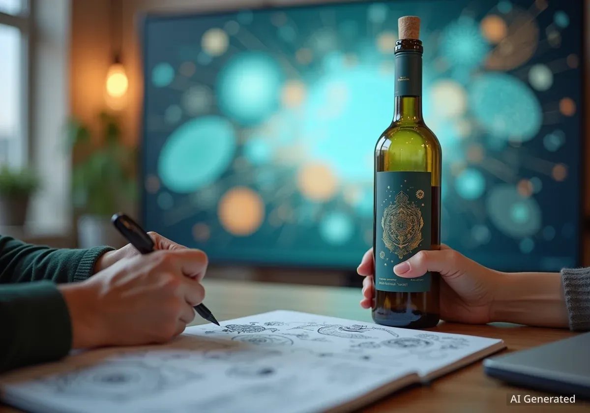
Wine Branding: DirtyVine's Fresh Approach
Goodside developed the brand identity for DirtyVine, a wine company focused on simple ingredients and sustainable farming. The design moves away from traditional wine branding, which often features either old-fashioned aesthetics or overly minimalist styles. Goodside aimed for a rebellious yet accessible feel, designing the strategy, identity, packaging, and website.
The core concept, "Bottled Sunshine," is expressed through vibrant colors, loose, imperfect illustrations, and a witty tone of voice. This approach avoids pretension, making the brand more approachable. The typography is relaxed, and a hand-drawn wordmark by Jessica Hische provides a crafted anchor to the identity.
Sustainable Focus
DirtyVine emphasizes its commitment to sustainable farming practices. This focus on environmental responsibility is reflected in the brand's natural and unpolished aesthetic, suggesting a connection to the earth rather than corporate gloss.
Even the packaging contributes to an unpolished joy, making the unboxing experience part of the brand's playful ritual. The world created by Goodside feels natural and effortless. It is modern but grounded in agricultural roots rather than advanced technology. Collaboration with Baggy Studio on the digital platform extended this ethos, resulting in a website that feels as simple and inviting as a conversation over a glass of wine.
DirtyVine is designed to be a brand that consumers can live with, not just consume. This represents a deeper level of brand consideration and engagement.
Hot Sauce Packaging: Calénton's Ancient Roots, Modern Look
Designer Morgan Hastie drew inspiration from Mexico's ancient history for the Calénton Hot Sauce brand. The packaging design incorporates carvings, ruins, and bold symbols that Hastie encountered during his travels in Mexico. These historical references influenced the illustration style and typographic choices, creating an identity that feels connected to heritage while appearing contemporary.
The bottles themselves are sleek and minimal. However, die-cut labels and a high-contrast color palette push the design into a more experimental space. Neon greens and fiery reds are set against graphic black details. This combination balances tradition and modernity, appealing to younger audiences.
Design Elements
- Inspiration: Ancient Mexican carvings and ruins
- Color Palette: Neon greens, fiery reds, graphic black
- Typography: Reflects historical symbols
- Target Audience: Younger consumers seeking modern heritage
The design system is premium yet expressive, avoiding sterility or clichés often found in the hot sauce category. Morgan Hastie noted that the project aimed at "experimenting to bring those little elements of traditional art style into the modern design layout." This experimentation has proven successful.
In a market often filled with cartoon chili peppers and flames, Calénton stands out as both sophisticated and playful. It celebrates heritage without making it seem outdated.
Fashion Search: Hey Savi's AI-Powered Discovery
Hey Savi, a new fashion search engine, aims to improve online shopping by making product discovery as intuitive as music recognition services like Shazam. The platform uses AI-powered image recognition to provide seamless, brand-agnostic recommendations tailored to user preferences.
YeahNice was responsible for translating this promise into a fresh and accessible visual identity and launch campaign. The brand focuses on the user, employing a conversational system centered around a distinctive 'speech bubble' motif. This element appears across digital and campaign assets, linking the AI technology to something human and familiar.
Hey Savi's Promise
The platform offers a streamlined process: Snap. Search. Buy. Wear. This four-step approach highlights the speed and ease of turning inspiration into a purchase.
The team also produced a concise sizzle film that guides users through the product in four steps. This approach demonstrates how quickly inspiration can become a reality. Combined with smart storytelling and understated motion graphics, the identity avoids over-explaining the technology. Instead, it feels useful, elegant, and refreshingly humble for a tech product.
In a market where many shopping platforms emphasize numerous features, Hey Savi's clear and understated approach is designed to make it memorable.
Festival Rebrand: The Sunburn Project's Energetic Identity
New York-based designer Ipshita Krishan undertook a self-initiated rebrand of India's Sunburn Festival, Asia's largest dance event. The project, called The Sunburn Project, explores what an EDM festival identity looks like when reduced to its core elements. Krishan found her answer in the energy of bodies in motion, which gave the festival its name.
The rebrand channels the intense energy of all-night beach parties into a system of visual patterns and typography. Krishan used literal sunburn marks as inspiration, translating them into graphic gradients and textures. Paired with a palette of infrared-inspired reds and oranges, the visuals radiate warmth and intensity, mimicking the thermal glow of a dense crowd.
- Designer: Ipshita Krishan
- Festival: Sunburn Festival (India)
- Inspiration: Heat, bodies in motion, sunburn marks
- Visuals: Graphic gradients, infrared colors, gothic serif typography
Typography grounds the identity in gothic serif forms, a deliberate contrast to the sleek, modernist styles often seen in music branding. Elongated serifs, tight kerning, and alternate characters inject movement into the letterforms. This gives even static words the pulse of a bassline.
While conceptual, the project powerfully demonstrates how cultural history and visual experimentation can merge. By using the human body as inspiration, Krishan reframes festival branding not merely as decoration, but as a visceral experience. This bold approach highlights how compelling design can emerge when designers create their own briefs and take risks beyond client expectations.