


The Canterbury-Bankstown Bulldogs, an Australian professional rugby league club, have introduced a new logo intended to honor its 90-year history. However, the redesign has been met with widespread disapproval from supporters, many of whom describe it as generic and have suggested it resembles an AI-generated image.
In response to the club's official unveiling, fans took to social media to voice their disappointment. Some demonstrated how easily a similar design could be created using artificial intelligence, fueling criticism that the new emblem lacks originality and fails to capture the team's identity.
Key Takeaways
- The Canterbury-Bankstown Bulldogs released a new logo, updating their brand identity.
- The club stated the design honors its 90-year legacy while looking toward the future.
- A significant number of fans have criticized the logo, calling it "awful" and "generic."
- Supporters have used AI tools like ChatGPT to create similar images, arguing the official logo lacks a unique, human touch.
Club Unveils Modernized Emblem
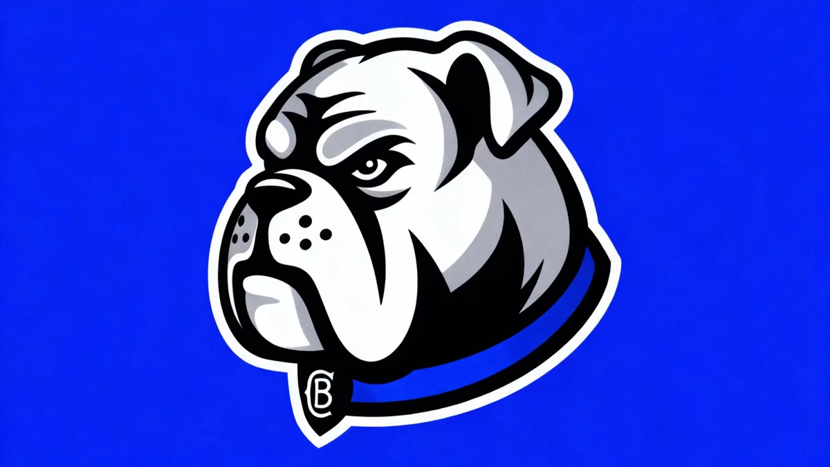
The new logo features a modernized, fierce-looking bulldog's head, which takes inspiration from a design the team used between 1998 and 2004. This marks a departure from the full-body bulldog emblem that has been the team's primary symbol since 1978. The updated design is cleaner and more stylized, with the club's insignia subtly placed on the dog's collar.
In an official press release, Bulldogs Chief Executive Officer Aaron Warburton defended the new direction. He emphasized the club's intention to bridge its long history with its future ambitions.
"We’re incredibly proud of the design and believe it strikes the right balance between paying tribute to our 90-year legacy and capturing the energy, ambition and unity that will define our future," Warburton stated.
Despite the club's confidence, the announcement did not resonate well with a large portion of the fanbase, who feel the new design fails to connect with the team's heritage and fighting spirit.
The Challenge of Sports Rebranding
Rebranding a professional sports team is a notoriously difficult task. Logos and team colors are deeply tied to fan identity, nostalgia, and a sense of community. Any change, no matter how well-intentioned, can be perceived as a departure from tradition, often leading to immediate and passionate resistance from loyal supporters.
Fan Criticism and AI Comparisons
The most pointed criticism leveled against the new Bulldogs logo is its perceived generic quality. Many fans argued that it looks like a stock image or a default option in a video game. One supporter commented that "the new Bulldogs logo is the generic dog logo you scroll past when you make your own team on Rugby League 2."
This sentiment was amplified when fans began using generative AI to prove their point. Several supporters posted images they created with text prompts in AI programs, showing how quickly a similar-looking bulldog emblem could be produced. The results, while not identical, were close enough to support the argument that the official logo lacked a distinctive, creative edge.
One fan wrote, "I just made the new Bulldogs logo on ChatGPT, and yes, I know it’s not identical, but I’m sure with one more prompt I could get it looking the same." This specific critique highlights a modern challenge in graphic design, where the accessibility of AI tools has made audiences more aware of, and sensitive to, designs that appear formulaic.
A Legacy of Logos
The Canterbury-Bankstown Bulldogs have a rich visual history. The club's most recognized logo, featuring a full-bodied bulldog within a shield, was introduced in 1978 and became an iconic symbol for decades. The new head-only design is a direct reference to a temporary logo used from 1998 to 2004, a period that the club is now drawing inspiration from for its modern identity.
The Importance of Identity in Sports Branding
A Link to History
For sports teams, a logo is much more than a marketing tool; it is a symbol of identity, history, and community. The bulldog has represented the Canterbury-Bankstown club's tenacity and fighting spirit for over four decades. Fans often form a deep emotional connection with these symbols, which represent memories of great victories and shared experiences.
The strong negative reaction suggests that many supporters feel the new, cleaner aesthetic has stripped away the grit and character associated with the traditional emblem. Words like "awful" and "embarrassing" were common in online discussions following the reveal.
Navigating Modern Design Trends
The club's attempt to modernize its brand aligns with a broader trend in sports, where teams often simplify their logos for better digital application on social media, merchandise, and broadcasts. Clean lines and minimalist designs are often favored for their versatility.
However, the Bulldogs' case serves as a cautionary tale. In the pursuit of a modern look, the design team may have underestimated the fanbase's attachment to the more detailed and traditional imagery. The resulting logo, while technically clean, has been widely interpreted as soulless and disconnected from the club's core identity, a sentiment powerfully articulated by the AI-generation comparisons.
As the club moves forward, it faces the challenge of winning over a skeptical and disappointed fanbase. The controversy demonstrates the delicate balance that sports organizations must strike between evolving their brand for a new era and honoring the deep-seated traditions that define them.